One of the occasionally annoying features of R and thus ggplot2 is dealing with factors. In this post, I’ll go through how to handle ordering of factors in ggplot2 and the manual assignment of colors to those categories.
For this example, I’m going to use data collected by Daniel Ziblatt on the European revolutions of 1848. Specifically, for each county in the data, we can code the county as having a revolution, having a constitutional concession, or no revolution. For each county, we also know distance from Paris (in kilometers) and the price shock in wheat in 1847. These are meant to test arguments made about the locations of of the 1848 revolutions: that countries that experienced them were closer to Paris and the French Revolution (diffusion argument) and/or revolutions were the result of economic hardships.
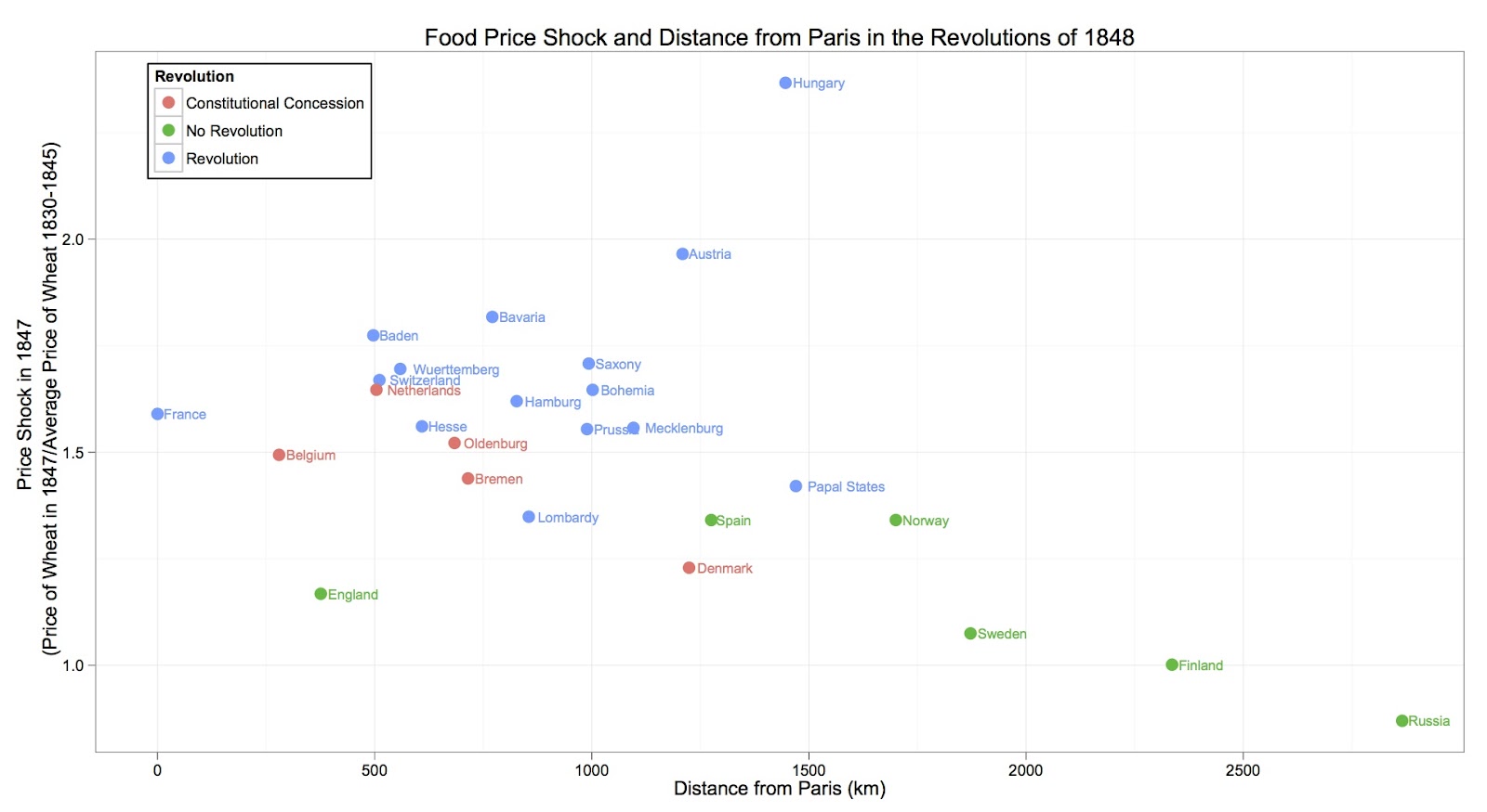
An initial attempt at plotting this may look something like this:
ggplot(my.data, aes(Distance, PriceSpike, color=Revolution)) +
geom_point(shape=20, size=5) +
geom_text(aes(label=Country), size=3, hjust=-0.15) +
scale_x_continuous("Distance from Paris (km)") +
scale_y_continuous("Price Shock in 1847 \n (Price of Wheat in 1847/Average Price of Wheat 1830-1845)") +
theme_bw()  +
opts(title="Food Price Shock and Distance from Paris in the Revolutions of 1848") +
opts(legend.position=c(.12,.9), legend.background=theme_rect(fill="white"))
The result is:
Note that the factor variable that we are plotting is Revolution and ggplot2 automatically orders it in the legend (alphabetically) and assigns it default colors. Also note that I manually positioned the legend within the plotting space.
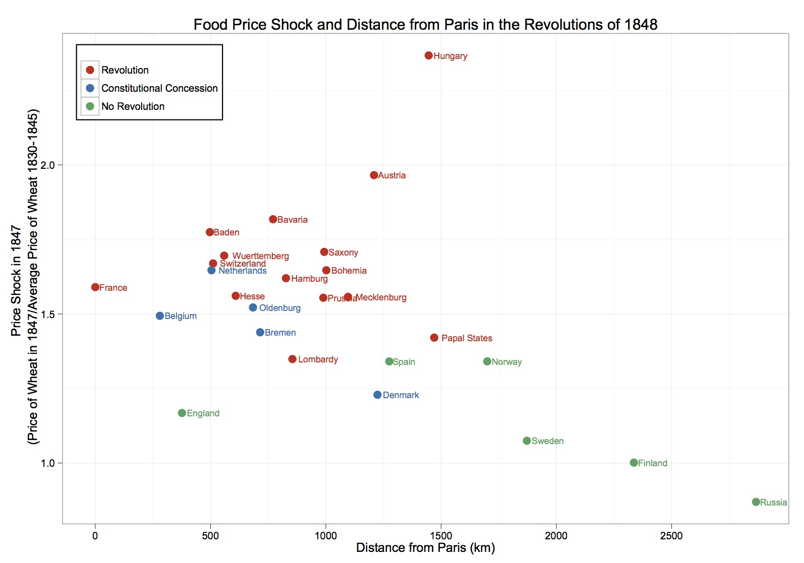
What if we wanted “Revolution” to come first in the legend, followed by “Constitutional Concession”, then “No Revolution”? Moreover, what if we wanted the color for “Revolution” to be red and the color for “No Revolution” to be green?
We can create an additional vector of the length of the number of observations in the my.data dataframe called Revolution.order:
Revolution.order <- my.data$Revolution
Revolution.order[Revolution.order=="Revolution"] <- 1
Revolution.order[Revolution.order=="Constitutional Concession"] <- 2
Revolution.order[Revolution.order=="No Revolution"] <- 3
Revolution.order <- as.integer(Revolution.order)
This vector now contains the ordering of the factor variable which we can feed into ggplot through the reorder() function:
ggplot(my.data, aes(Distance, PriceSpike, color=reorder(Revolution,Revolution.order))) +
geom_point(shape=20, size=5) +
geom_text(aes(label=Country), size=3, hjust=-0.15) +
scale_x_continuous("Distance from Paris (km)") +
scale_y_continuous("Price Shock in 1847 \n (Price of Wheat in 1847/Average Price of Wheat 1830-1845)") +
theme_bw() +
opts(title="Food Price Shock and Distance from Paris in the Revolutions of 1848") +
scale_color_manual(name="", values=c("#D7301F", "#0570B0", "#2CA25F")) +
opts(legend.position=c(.12,.9), legend.background=theme_rect(fill="white"))
Note that we can manually supply the colors for the factor through scale_color_manual().
The result is:

