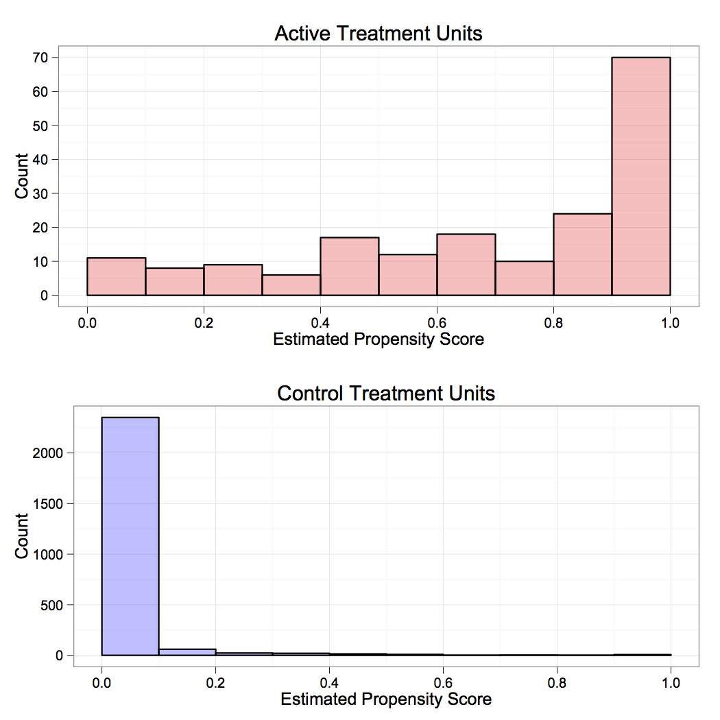
Here’s a quick example of plotting histograms next to one another in ggplot2. I wanted to plot the estimated propensity scores for treated and control units for the Lalonde non-experimental data.
First, generate the estimate propensity scores using the fitted values from a logit model where the dependent variable is the treatment indicator. The dataframe (stripped of the outcome) is called dta.nooutcome.
glm1  <- glm(TREAT~MARR+NODEGREE+BLACK+HISPANIC+EDUC+AGE+RE74+RE75+U74+U75, family=binomial, data=dta.nooutcome)
pscore1 <- glm1$fitted
Specifically, we can make two histograms for the distribution of the propensity scores corresponding to the two treatment levels.
plot1<- ggplot() +
geom_histogram(aes(x = pscore1[dta.nooutcome$TREAT==1]), binwidth=0.1, linetype=1, alpha=.25, color="black", fill="red") +
scale_y_continuous(name="Count") +
scale_x_continuous(name="Estimated Propensity Score", limits=c(0,1)) +
theme_bw() +
opts(title="Active Treatment Units")

plot2<-ggplot() +
geom_histogram(aes(x = pscore1[dta.nooutcome$TREAT==0]), binwidth=0.1, linetype=1, alpha=.25, color="black", fill="blue") +
scale_y_continuous(name="Count") +
scale_x_continuous(name="Estimated Propensity Score", limits=c(0,1)) +
theme_bw() +
opts(title="Control Treatment Units")
To arrange the two plots next to each other, we can use the gridExtra library.
grid.newpage()
pushViewport(viewport(layout=grid.layout(2,1)))
print(plot1, vp=viewport(layout.pos.row=1, layout.pos.col=1))
print(plot2, vp=viewport(layout.pos.row=2, layout.pos.col=1))
Note that one can pass the number of rows and columns to the grid.layout() option. Without explicitly specifying width and height of each cell, Viewport automatically arranges the plots.
The result is:
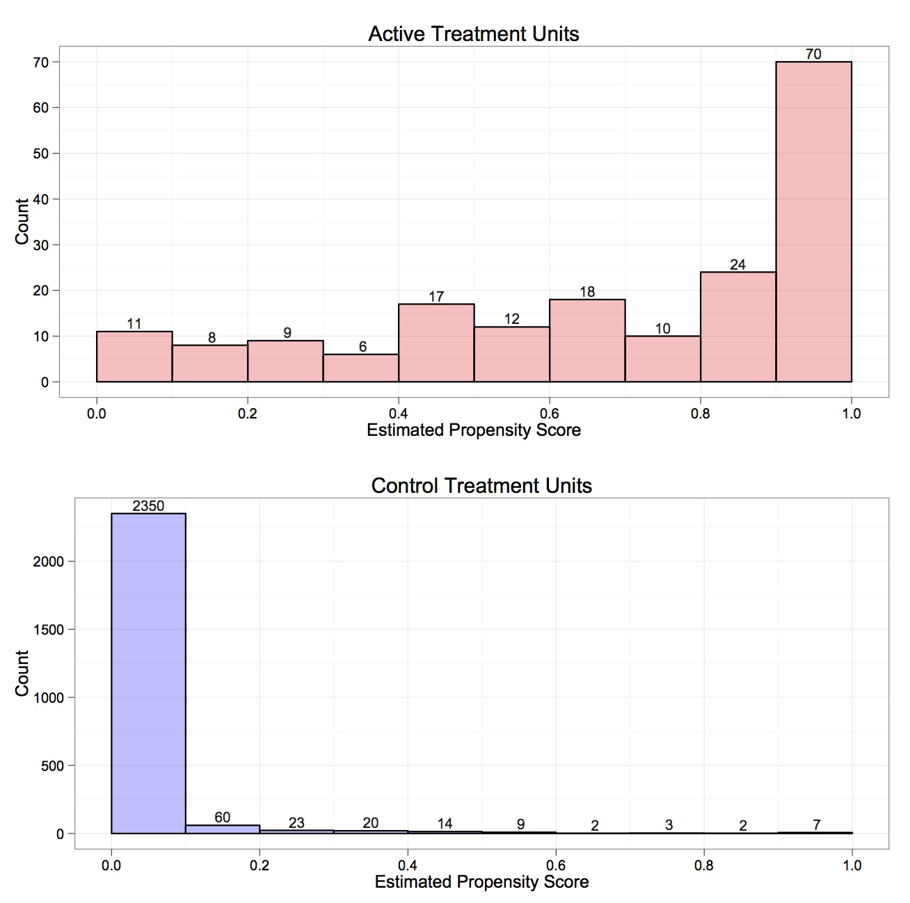
If we want to add numbers to the top of each bar to make it easier to see the number of units in each propensity score bucket, we can modify the existing plots as follows:
plot1a <- plot1 +
geom_text(aes(x=ggplot_build(plot1)$data[[1]]$x, y=ggplot_build(plot1)$data[[1]]$count , label = sprintf("%2.0f", ggplot_build(plot1)$data[[1]]$count)), position = position_dodge(width = 1), size = 3.5, vjust = -0.3, colour = "grey10")
plot2a <- plot2 +
geom_text(aes(x=ggplot_build(plot2)$data[[1]]$x, y=ggplot_build(plot2)$data[[1]]$count , label = sprintf("%2.0f", ggplot_build(plot2)$data[[1]]$count)), position = position_dodge(width = 1), size = 3.5, vjust = -0.3, colour = "grey10")

grid.newpage()
pushViewport(viewport(layout=grid.layout(2,1)))
print(plot1a, vp=viewport(layout.pos.row=1, layout.pos.col=1))
print(plot2a, vp=viewport(layout.pos.row=2, layout.pos.col=1))
Note that we extract the counts of units in each of the histogram bins using the ggplot_build() function and then subsetting the data. Alternatively, one could go about this whole exercise by first manually putting together a dataframe with the bins and the associated counts and passing it to the geom_bar() and geom_text() functions within the ggplot package.
The result is:

