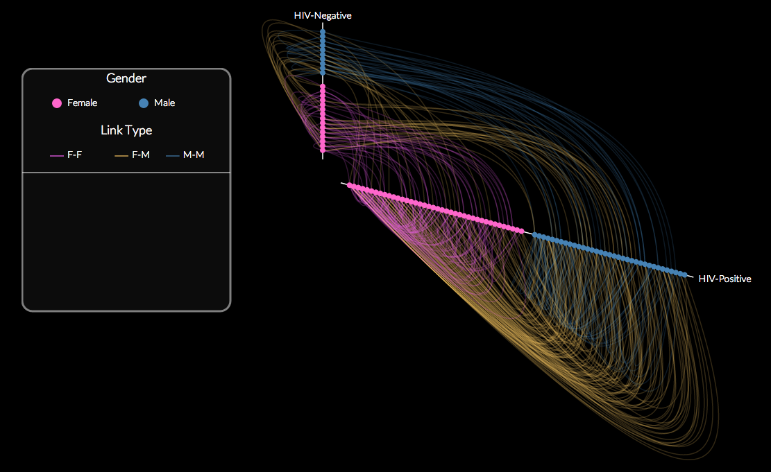
Here is a visualization I constructed using D3.js based on a visualization for Harvard’s Stat 221 class of a network of individuals for whom HIV status is known (original visualization here). I wanted the visualization to maximally exploit the information available in the data, such as for example whether friendships are mostly seroconcordant (with individuals of the same HIV status) or serodiscordant. I also wanted to see if most friendships were of the same gender or not. Hence, I adapted the hive plot template for this network data. Here is a static picture of the resultant network:
Note that the two axes of the hive plot connote the HIV status of the individuals. The nodes are colored and ordered first by gender and then within each gender are subsequently ordered by the number of links, where the nodes closer to the origin of the axis are more well-connected. The links are also color-coded by whether they are friendships between the same gender or opposite genders. Whether a link is serodiscordant or seroconconcordant is evident from its placement relative to the axes.
The full, interactive visualization is available here and the code is available on Github.
For those new to D3.js, here are some great resources for getting started:
