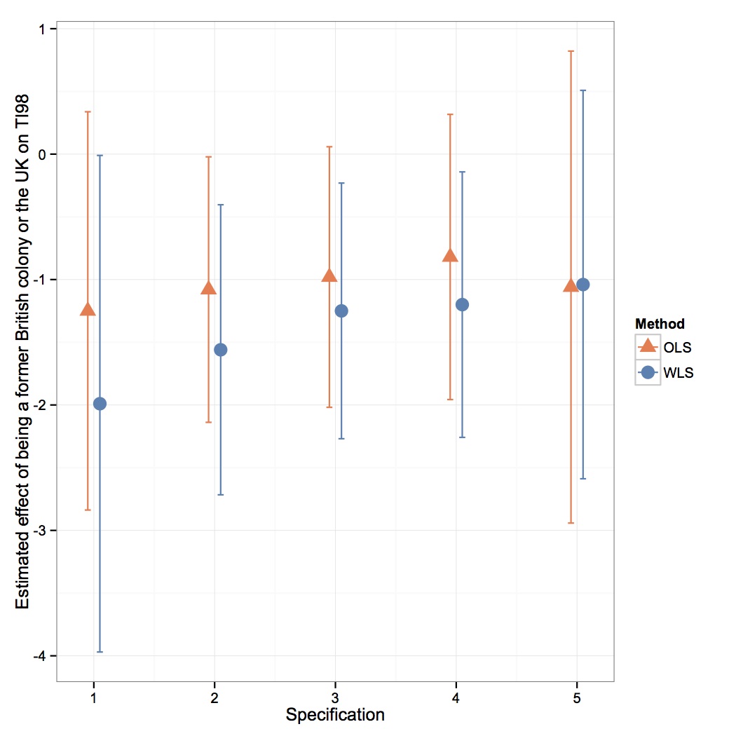
A graphical approach to displaying regression coefficients / effect sizes across multiple specifications can often be significantly more powerful and intuitive than presenting a regression table. Moreover, we can easily express uncertainty in the form of confidence intervals around our estimates. As a quick example, suppose that we wanted to compare the effect of British colonial status upon country-level corruption across multiple specifications and two methods (OLS and WLS) from the following paper: Treisman, Daniel. 2000. “The causes of corruption: a cross-national study,” Journal of Public Economics 76: 399-457.
Specifically, the dependent variable is TI98, the perceived corruption score calculated by Transparency International for 1998. The variable whose effect we seek is an indicator that equals 1 if the country is a former British colony or the UK, and 0 otherwise. I took the coefficients and associated standard errors on British colonial status from Tables 2 and 3 across the 5 different specifications where TI98 is the dependent variable. I then entered them into a data frame with the following structure:
| coef | se | method | specification | lb | ub | |
| 1 | -1.99 | 1.01 | WLS | 1 | -3.969564 | -0.01043638 |
| 2 | -1.56 | 0.59 | WLS | 2 | -2.716379 | -0.40362125 |
| 3 | -1.25 | 0.52 | WLS | 3 | -2.269181 | -0.23081873 |
| 4 | -1.20 | 0.54 | WLS | 4 | -2.258381 | -0.14161945 |
| 5 | -1.04 | 0.79 | WLS | 5 | -2.588372 | 0.50837155 |
| 6 | -1.25 | 0.81 | OLS | 1 | -2.837571 | 0.33757083 |
| 7 | -1.08 | 0.54 | OLS | 2 | -2.138381 | -0.02161945 |
| 8 | -0.98 | 0.53 | OLS | 3 | -2.018781 | 0.05878091 |
| 9 | -0.82 | 0.58 | OLS | 4 | -1.956779 | 0.31677911 |
| 10 | -1.06 | 0.96 | OLS | 5 | -2.941565 | 0.82156543 |
Note that I calculated the upper bound (ub) and lower bound (lb) of the 95% confidence interval using the standard errors provided in the table (I assumed normality holds due to the Central Limit Theorem, which may be questionable in some specifications given small sample sizes).
I then generated the following plot:
Here is the code for making this plot in ggplot2 from the dataframe I provided above:
pd <- position_dodge(width=0.2,height=NULL)

ggplot(treisman, aes(specification,coef, color=method)) +
geom_point(aes(shape=method),size=4, position=pd) +
scale_color_manual(name="Method",values=c("coral","steelblue")) +
scale_shape_manual(name="Method",values=c(17,19)) +
theme_bw() +
scale_x_continuous("Specification", breaks=1:length(specification), labels=specification) +
scale_y_continuous("Estimated effect of being a former British colony or the UK on TI98") +
geom_errorbar(aes(ymin=lb,ymax=ub),width=0.1,position=pd)
The geom_errorbar() function plots the confidence intervals. Note that I use the position_dodge() function to horizontally shift the coefficients and confidence intervals for the same specifications for clarity. The height=NULL option can be omitted. The color and shape for the legend is controlled manually.
What would happen if I just set name="Method" for the scale_color_manual command, but left out the scale_shape_manual command, letting it be automatically determined:
ggplot(treisman, aes(specification,coef, color=method)) +
geom_point(aes(shape=method),size=4, position=pd) +
scale_color_manual(name="Method",values=c("coral","steelblue")) +
theme_bw() +
scale_x_continuous("Specification", breaks=1:length(specification), labels=specification) +
scale_y_continuous("Estimated effect of being a former British colony or the UK on TI98")   +
geom_errorbar(aes(ymin=lb,ymax=ub),width=0.1,position=pd)
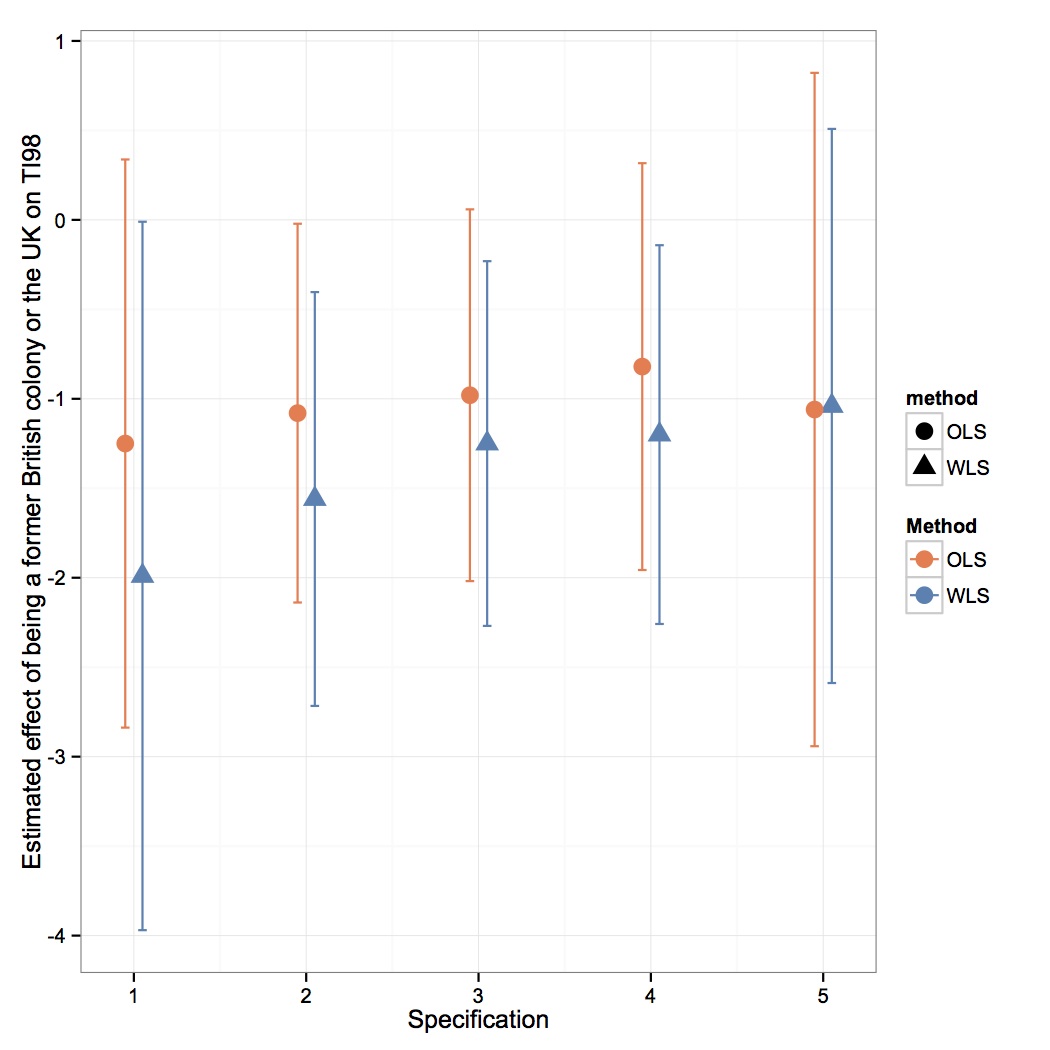
This would be the plot:
This happens because I also set the shape of the points to be determined by the method variable, just as for color. I thus I need to manually give the same name to both scales, or else otherwise they are automatically broken up into two legends, one manual titled “Method” and one automatic title “method”.
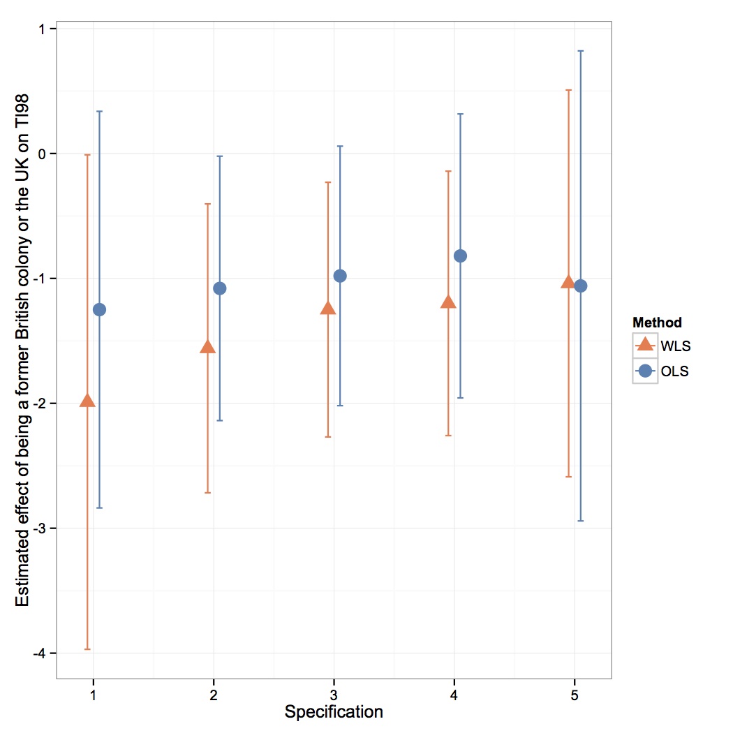
What if I wanted to reorder the ordering of the methods in the plot; that is, if we wanted WLS to be plotted first, then OLS?
This can be achieved with the following command before running the first block of code on this page.
df$method <- reorder(df$method,rep(1:2,each=5))The result is the following:
Finally, suppose that we wanted to customize the x-axis labels by tilting them diagonally and changing them to a dark grey. Adding the following extra piece of code to the blocks of code above would accomplish that:
+ theme(axis.text.x=element_text(angle=45,color="darkgray"))

